September 2024 - March 2025
Unifying scattered dashboards to boost researcher insights
Product designer: me
Subject matter experts: 3
Developers: 2
Product owner: 1
3% increase in dashboard usage
5% increase in geographic visualization interactions
3% increase in temporal visualization interactions
Reduced time switching between views
Increased adoption beyond taxonomy sunburst
Improved pattern discovery through interactive charts
Project Overview
Redesigning the dashboard to help researchers visualize virus sequence data
The NCBI Virus Dashboard enables visualization of virus sequence data. Dashboard functionality was split across two locations, and this disrupted research workflows. Additionally, the dashboards weren't well connected to the results table.
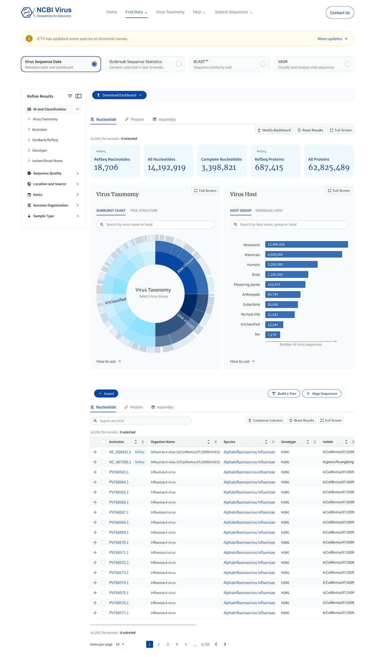
As sole designer, I unified the dashboard functionality into a single location and connected it to the results table, enabling seamless exploration in both visual and tabular formats.
After: one consolidated dashboard
Challenge
Split dashboards and poor integration with results table disrupted workflows
Due to historical reasons, NCBI Virus had two separate visualization dashboards: one on the homepage and another on a dedicated page accessible only through the results table.
Researchers couldn't find tools to visualize their filtered datasets, and when they did, the filters would reset — making the visualizations useless.
I need to visualize the geographic distribution of this virus for my students, but I can't find how to visualize it.
Virology Professor at a University
Problem Discovery
Analyzed data and user workflows, revealing dashboard fragmentation and underutilization
Usage analytics revealed:
01
Single widget focus:
Most researchers used only the taxonomy sunburst from the first dashboard and the geographic map from the second dashboard, leaving other visualizations practically untouched.
02
Low dashboard adoption:
The second dashboard had very low usage overall, with switching back to the Results Table page being its most used feature.
The first dashboard on the homepage shows usage analytics for the most (1) and least (6) used features
The second dashboard shows usage analytics for the most (1) and least (9) used features
User Research Results
Two distinct workflows revealed why dashboards were underutilized
User research identified two dashboard workflows:
Dashboard-First Users: Explore visualizations first → then analyze details in the results table
Table-First Users: Filter data in the table → visualize patterns → return to export
Beyond the issues found in analytics, both groups faced additional problems:
03
Researchers couldn't find dashboards:
The homepage dashboard sat below the fold. The results table dashboard was buried in a cluttered tab interface.
04
Researchers couldn't see data relationships:
With visualizations scattered across two separate places, researchers missed connections between their data.
05
Researchers lost their work when switched to other view:
Moving between the results table and dashboards reset all filters and selections, forcing them to start over.
06
Researchers didn't understand widgets:
They couldn't tell what data each widget displayed or how to interact with them.
User feedback: homepage dahboard
User feedback: finding access to the second dashboard
User feedback: unclear dashboard functions
User feedback: dashboard interactivity and download
Success Metrics
Targeting discoverability, unity, and research impact
I set clear goals to transform the dashboard.
Making visualization tools easy to find would save researchers time. A unified dashboard would preserve their workflow. Increased use in publications would show real-world impact. The metrics were:
01
Better dashboard discoverability - Researchers can easily find and access all visualization tools
02
Unified dashboard experience - All dashboards consolidated in one location
03
Increased research impact - Researchers cite our resource in their publications and use our dashboard visualizations in their work
Dashboard page prototype demo
Exploring Options
Dashboard and table on one page versus two separate pages
I evaluated two approaches for unifying the dashboard experience.
01
Combining the dashboard and results table on one page promised seamless navigation but risked performance issues due to heavy data loads.
02
Separate pages with synchronized filters offered reliability while preserving user selections.
Developer constraints on data handling led us to choose synced filters. This balanced usability with technical feasibility.
Option 1: dashboard and table on one page
Option 2: dashboard and table on separate pages with shared filters
Design Solutions
Combined two dashboards into one, connected it to Results Table through shared filters, and enhanced charts
I transformed fragmented visualizations into a connected data exploration experience.
01
Unified dashboards and connected with the results table
Combined the two separate dashboards into one location
Synchronized filters with the results table so researchers keep their selections when switching views
Made chart interactivity visible by adding hover states and displaying tags above charts when elements are selected.
Before: two disconnected dashboards
After: one dashboard
02
Improved chart functionality
Added search functionalities to taxonomy and host charts for finding specific viruses
Grouped related hosts on Host chart and added a taxonomy tree on Virus Taxonomy chart for easier navigation
Explained color coding in geographic visualizations and added clear labels and filtering options to time-based charts — helping researchers understand and interact with their data
Taxonomy chart before
Taxonomy chart after
Host chart before
Host chart after
Geographic chart before
Geographic chart after
Impact and Insights
Partial improvements increased dashboard usage 3%, full integration awaits resources
Resource constraints limited implementation to select improvements.
What was shipped:
Geographic visualizations better show data distribution patterns
Yearly intervals added to temporal histograms for trend analysis
Improved chart interactivity feedback to clarify clickable elements
Partial filter connectivity between two dashboards and Results Table
These changes drove a 3% increase in dashboard usage, 5% increase in geographic visualization interactions, and 3% increase in temporal visualization interactions.
What remains:
Unified Dashboard with complete filter synchronization awaits development resources.
What I learned:
Designing interactive data visualizations deepened my understanding of how researchers explore complex datasets and the critical role dashboards play in revealing patterns across thousands of data points.
Other Work
Other NCBI Virus Projects
A collection of my design work for NCBI Virus resource


