Making viral data filtering and navigation more effective for scientists
MY ROLE
Product designer
TIMELINE
January 2024 - February 2025
TEAM
CHALLENGE
Unclear filter naming and a disorganized layout made it hard for scientists to narrow down viral data
NCBI Virus is a free NIH platform where scientists worldwide search, analyze, and download viral genomic data for research, public health, and vaccine development.
My earlier user research in 2023 showed that scientists did most of their work in the Results Table, but struggled to find its filters and understand what they did. They were also confused by the virus taxonomy. In January 2024, I started a follow-up study to learn how scientists name, group, and search for the data they need.
PROBLEM DISCOVERY
Initial research highlighted that scientists struggled with Results Table filters
The Results Table drew more comments than any other part of NCBI Virus, and most pointed to its filters. At the same time, the international virus naming committee changed the virus taxonomy, so the Virus filter had to change too.
01 · Hard-to-find filters
Scientists struggled to locate filters and buttons in the Results Table.
02 · Unclear filter functionality
Scientists couldn't tell what some filters did from their names alone.
03 · Confusing taxonomy search
The Virus filter, the most-used filter, showed a plain list of names with no rank or hierarchy. Later, ICTV renamed virus species, which added to the confusion.
These findings showed where the filters failed, but not how scientists expected them to work.

Results Table themes from the initial user research (2023), synthesized from quantitative and qualitative data
RESEARCH GOALS
Uncovering scientists' mental models to organize filters and columns
To learn how scientists expected to find and narrow down data, I set four research goals:
01
Grouping
Which filters and columns matter most?
How do scientists group them?
02
Function
What do scientists expect from each filter and column?
Where do they need an explanation?
03
Naming
How would scientists name filters and columns?
Which current names mislead them?
04
Taxonomy
How do scientists search by virus and host taxonomy?
Where does the current search fail?
METHODS AND PARTICIPANTS
Using mixed methods to uncover scientists' mental models, then exploring how they search by taxonomy
Filter and column organization, functionality and naming
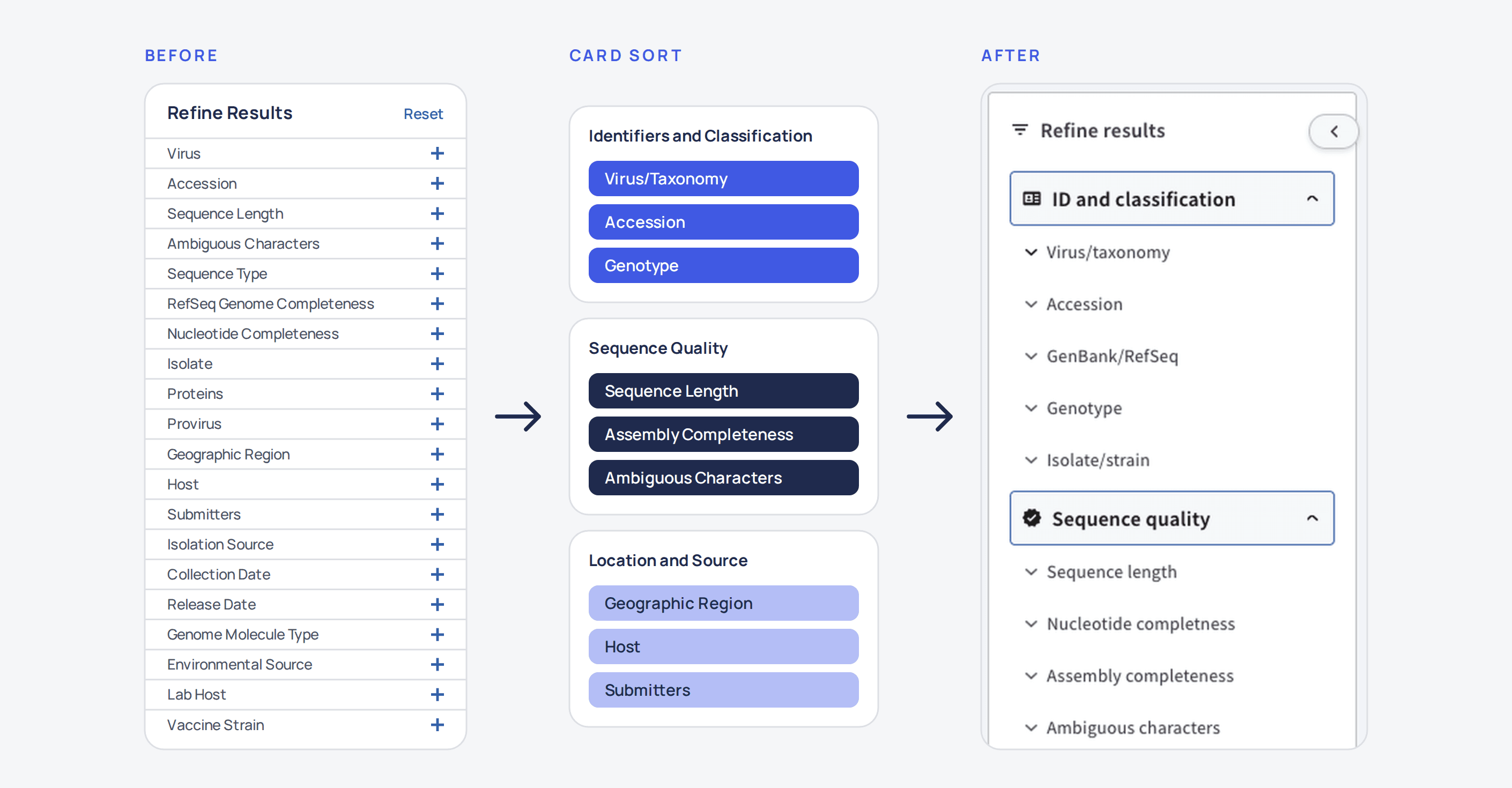
To make finding filters easier, I proposed two ways to organize filters: the most-used on top with the rest collapsed, or logical groups. Because recruiting scientists takes time, internal experts chose groups without testing both options with users. To define the groups, I ran card sorting with 7 internal experts. Meanwhile, two surveys and a Slack poll measured which names scientists preferred.
No items
7
internal experts
How to group 24 filters
How to organize 30 columns
38
responses
Which filter names match how scientists think

Filter naming user survey
Taxonomy search
Midway through the filter research, the virus naming committee (ICTV) changed how species are named, so the Virus filter had to change too. I interviewed virologists (found through taxonomy-related publications), reviewed literature and competitors to learn how scientists classify viruses, then built use cases, a journey map, and wireframes. Finally, I validated the direction with 5 scientists from my earlier research, in separate virus and host taxonomy sessions.
No items
7
virologists
How scientists use virus taxonomy in NCBI Virus
What problems do they have
15
publications
How researchers classify viruses
Where taxonomy causes problems
9
resources
How other resources present virus taxonomy
What we can borrow
5
participants
Whether the planned taxonomy search design works for scientists
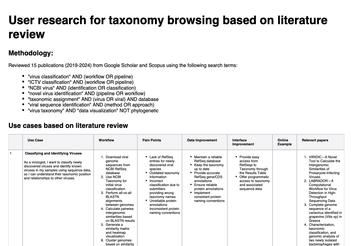
Scientific literature review outcomes: table with use cases, workflows, pain points, and proposed improvements for NCBI Virus interface
FINDINGS
Research with experts and scientists defined the filter groups, the preferred names, and the taxonomy search design
01
Filter organization:
Internal experts preferred to group filters over most-used on top with the rest collapsed and sorted filters and columns into the same six groups.

Card sorting result: filters and columns in the same six groups
02
Filter function and naming:
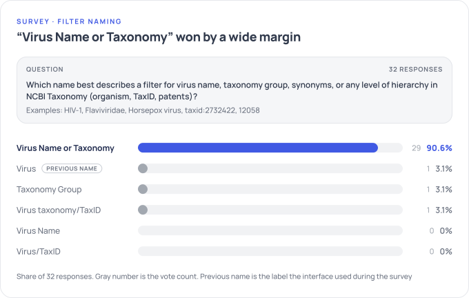
Each filter got a written definition, and scientists voted on the name that fit it best. The results showed that all of the most-used filters should be renamed.
03
Taxonomy:
Scientists wanted to identify a virus's taxonomy and see the rank and lineage it belongs to, but the filter's plain list did not show if a name is current, where it belongs, or which option to select.

User journey: using virus taxonomy search in NCBI Virus resource
OUTCOMES
Filters that match scientists' mental models, and a clearer taxonomy search
Filters were renamed, grouped and explained, and the taxonomy search now shows rank and lineage. After the redesign, overall filter usage rose by 34%, and usage of previously underused filters rose by 38%. The full results are in the Results Table redesign case study.
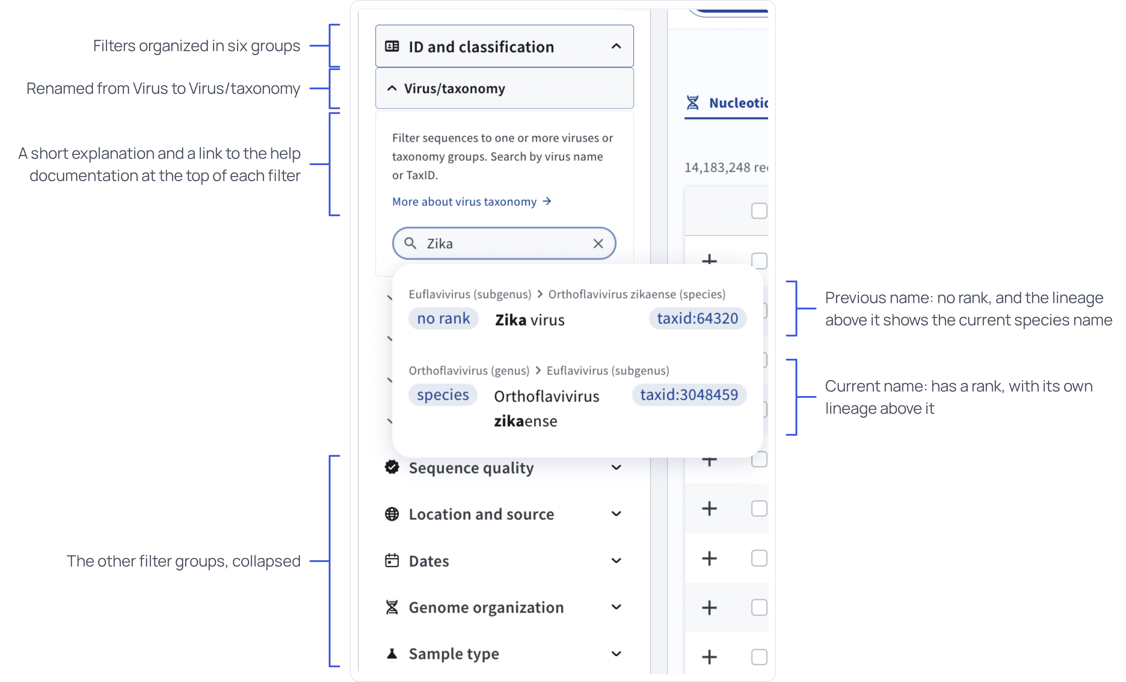
Redesigned filters panel in Results Table
LEARNINGS
Adapting research plans to constraints and changing priorities
Three things didn't go as planned, and each one changed how I ran the research.
01
Recruiting scientists was slow
I ran a moderated card sort with internal experts to define the filter and column groups.
02
Large surveys needed a long approval period
I added a short survey and a Slack poll to collect naming preferences faster.
03
ICTV renamed virus species mid-study
I expanded the study to cover taxonomy search.

Detailed presentation for the case study
OTHER WORK
Unifying the dashboard experience for scientific researchers
Making sense of data through visualizations